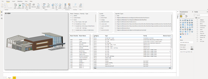
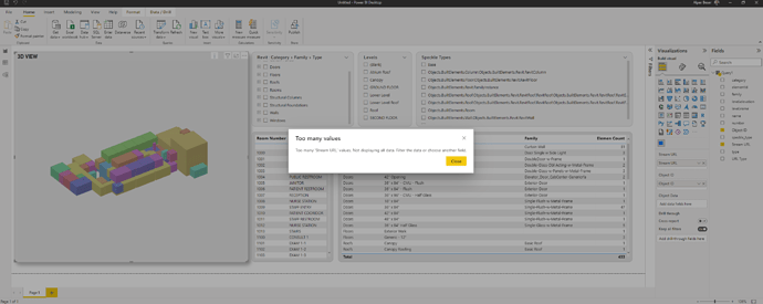
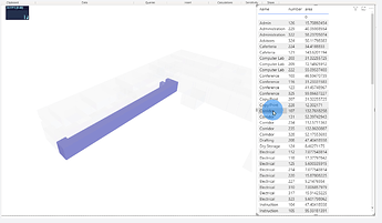
Hi guys, I just wanted to share a dashboard design that I created from Speckle PowerBI Visual. So far it seems very good. But it takes too much time to load elements. Overall it is working and thanks a million for this visual. Great work.
Amazing dashboard!!!
Is the Revit model you used free? Can it be downloaded from somewhere? Thanks!!!
Hi there, thanks @riverlander. The file I used is from Autodesk. They used it in their training.
Here is the website Learning Courses | Autodesk
But I don’t it is free or not for commercial usage.
Thanks so much for sharing @salpbes , we often struggle to see how Speckle is used in the wild ![]()
We’ll definitely take your feedback into consideration when working on more stable versions of the connector ![]()
Thank you very much! @salpbes
Thank you, guys. I am more than happy to help. Eagerly waiting for the new versions. I think with Power BI integrations there are endless possibilities for Speckle. Great work so far. If you need anything please let me know.
Hi guys any news on speckle Power BI?
Thanks in advance.
Hi all!
Just bumping this thread to let you know we’ve released a new version of the PowerBI visual that comes with some nice improvements and fixes:
Most of these have been added based on your feedback, so thank you very much for taking the time to test and come back to us ![]()
We hope you find these new features useful. Keep in mind that we’re still experimenting on how the visual and the data connector should interact and work, so do keep those requests and ideas coming to help us shape an awesome user experience ![]()
And here’s a sneak peek of what’s already coming on the next release ![]()
- New ColorBy input used exclusively for applying color filters (Object data is now named Tooltip Data and is used for tooltips
 )
) - New custom tooltips, where even the prop name is customisable. This also allows to apply data to the tooltip that is not stored in Speckle
Connecting any of the 2 (ObjectData or ColorBy inputs) will result in highlighting being active.
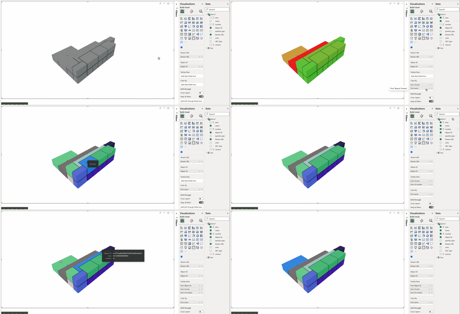
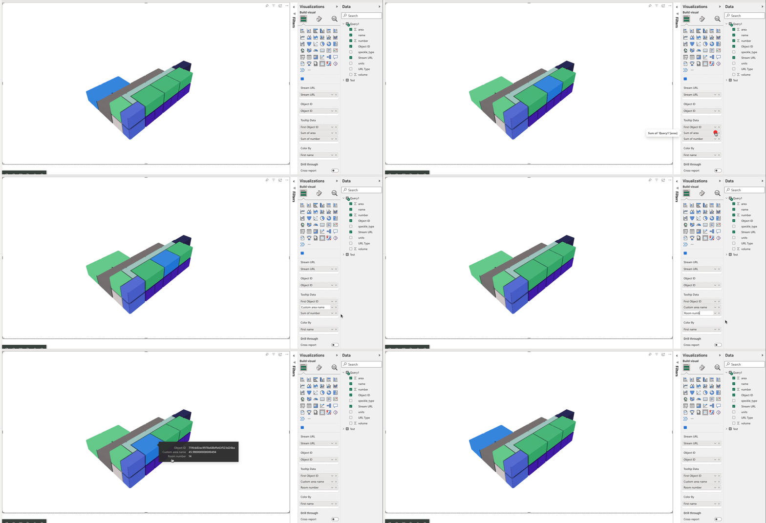
How do I select the branch I like it to take the model from?
Its randomly taking model from branches that I don’t intend to use

Alright, you can’t have spaces in your Branch name, just like python, use underscore.
Make sure you copy the URL from Chrome, as spaces are not “url safe” characters, they get swapped for %20 instead. If you just manually write the branch name in your url, this will work in chrome (as it n knows how to escape URLs) but won’t work in PowerBI (URL parsing logic is super basic in PowerQuery).
Notice the change in the space character done automatically by your browser:

![]()
So just to clarify, branches with spaces in the name are supported, but you need to have them properly encoded.
Hi
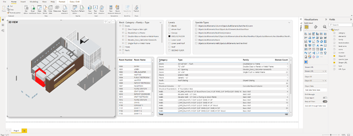
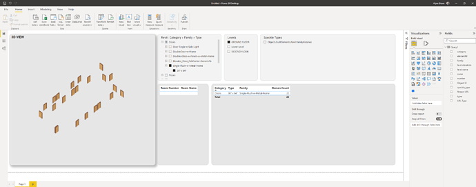
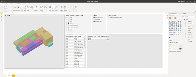
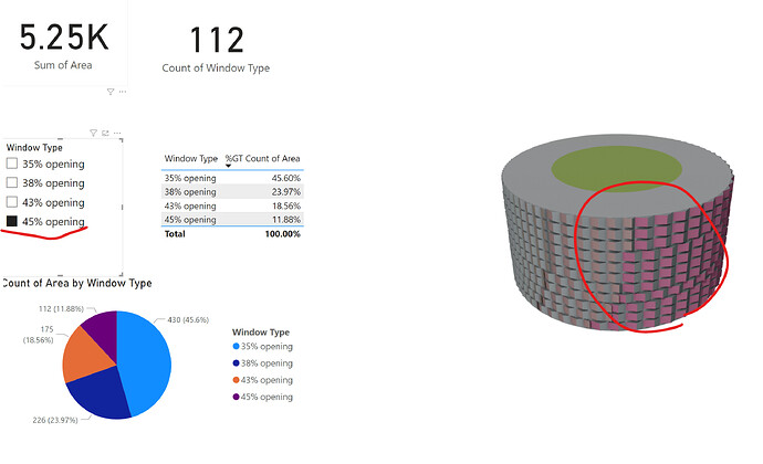
I somehow managed to have the images below kind of dashboard (thanks for the Speckle team).
I have tested two workflow (a&b).
I prefer to deal with the workflow-a because it is a simple workflow in this case.
Issue:
There is a problem with workflow-a:
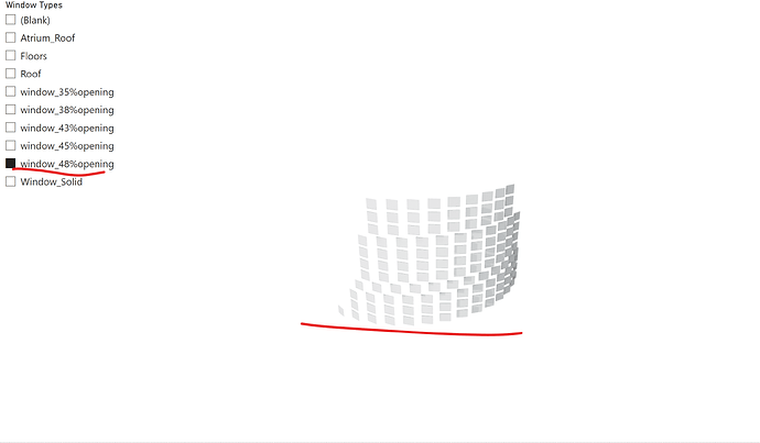
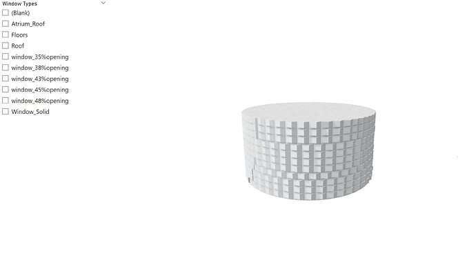
when I selected each window type one by one, no objects are highlighted in the 3d viewer (please see image below Workflow-a).
If the initial GH model has only windows type, then the objects are highlighted in the 3d viewer.
Also selected objects are highlighted in the 3d viewer in the workflow-b.
Q1) Is there any limitation of model’s file size or number of objects to use this method?
Q2) In the b case, the objects are highlighted but other objects are completely invisible.
Is there any way to make the other objects visible as the sample image in the Speckle tutorial?
Workflow-a) GH->PowerBI
Workflow-b) GH->Rhino->Revit->PowerBI
*The both (a&b) cases have almost the same amount of objects as shown image below.
Hi @SungBok_Song!
Thanks for reporting this and giving us some info of your workflows!
I think I’d have to have a look at your data and report in order to figure out what’s going on there. But it could be some miss-configuration of the visual inputs (or their names).
As for your questions:
There is a hard limit of 30000 objects that is placed by PowerBI’s API. Any more than that at it would be possible to show “pages”, but we haven’t implemented pagination yet on our visual.
I suspect this won’t really allow you to see more than 30k objects at once, but rather see 30k at a given time, and choose which “page” to show.
Based on your screenshots, I’m guessing you’re using a Slicer? AFAIK, slicers will filter the amount of data that is passed to the visual, so the visual “no longer knows” about the rest of the building.
PowerBI visuals have no context of the report, they only know about the data that is connected.
I guess what you want is the highlight behaviour, which is done by selecting multiple items at once.
To achieve what you want I think you may need to do some grouping of values on your side (possibly in PowerQuery directly).
Anyhow, If you can share the report and speckle stream (or a minimal reproducible version of it) I’d be happy to check out what’s going on and hopefully give you some tips
Hi AlanRynne,
Thanks for the reply.
Yes, I used Slicer.
what is the way to make groups of value?
I am really new to use speckle.
Where can I share my report with speckle team?
Is it enough to submit PowerBI file?
Yep, just send me a message privately with the Stream URL and the PowerBI file ![]()
For the groups, there are several ways of doing this, but the easies is to let a Matrix table group them for you.

Just add multiple “Rows”
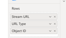
And the table will have nested grouped values that can be expanded/collapsed
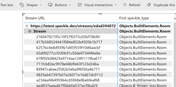
If you select any of the parent items, all the items bellow it will be “selected” and this should give you the highlighted items with the rest of the building ghosted.
There are other ways of doing this by doing some data wrangling on PowerBI’s side… Anything more advance will require some PowerQuery skills (this is not Speckle specific, any data received in PowerBI usually requires of some massaging at least)
Hope this helps! And I look forward to receiving your report ![]()
7 posts were split to a new topic: Thanks for the PowerBI improvements - Example Implementation!
