As always, you can get access to our latest developments by joining our exclusive Insiders and share real-time feedback with us, discuss what you want to see happening in FE2 and, of course, report any bugs you might find . After joining, you will receive an email to access FE2’s latest version to try it out. If you already use FE2’s development environment, you can keep testing here latest.speckle.systems.
NB: Don’t rely on you data staying put on either FE2 or the original dev latest server. We are liable to tear it down to build it up, set it on fire and generally break things!!
We’re excited about these changes; they represent a great milestone. We can’t wait to see lots of you joining and giving us feedback to make FE2 the best version it can be.
In the Item/Structure Tree 1 :
I would prefer a bit more contrast For the parent Model name Text.
currently it is just bold Text. Which looks a bit shy when having more
than one Model open, to estimate which child items belong to which
Model. Or where one Model ends and the next begins is not as easy
legible as I would prefer.
In the Item/Structure Tree 2 :
Not sure if Visibility Control Icon needs to be hidden and only appear
on mouse over. As for me Visibility is one of the main controls.
Yes, it looks much cleaner that way but feels like Apple Mail where
you have to find a location in empty UI to make potential attachments
visible and accessible.
View Navigation :
I would love a “Zoom-about-Cursor” mode.
For me the best invention in CAD navigation, as it basically makes any
(linear) Pan unnecessary,
Zoom into point of interest, afterwards scroll out, position cursor to next
area of interest and zoom in again. As scrolling is so fast, cheap and easy.
If implementation is tedious, alternative workaround : Zoom-about-Selection
(As it already works for Zoom Extends …)
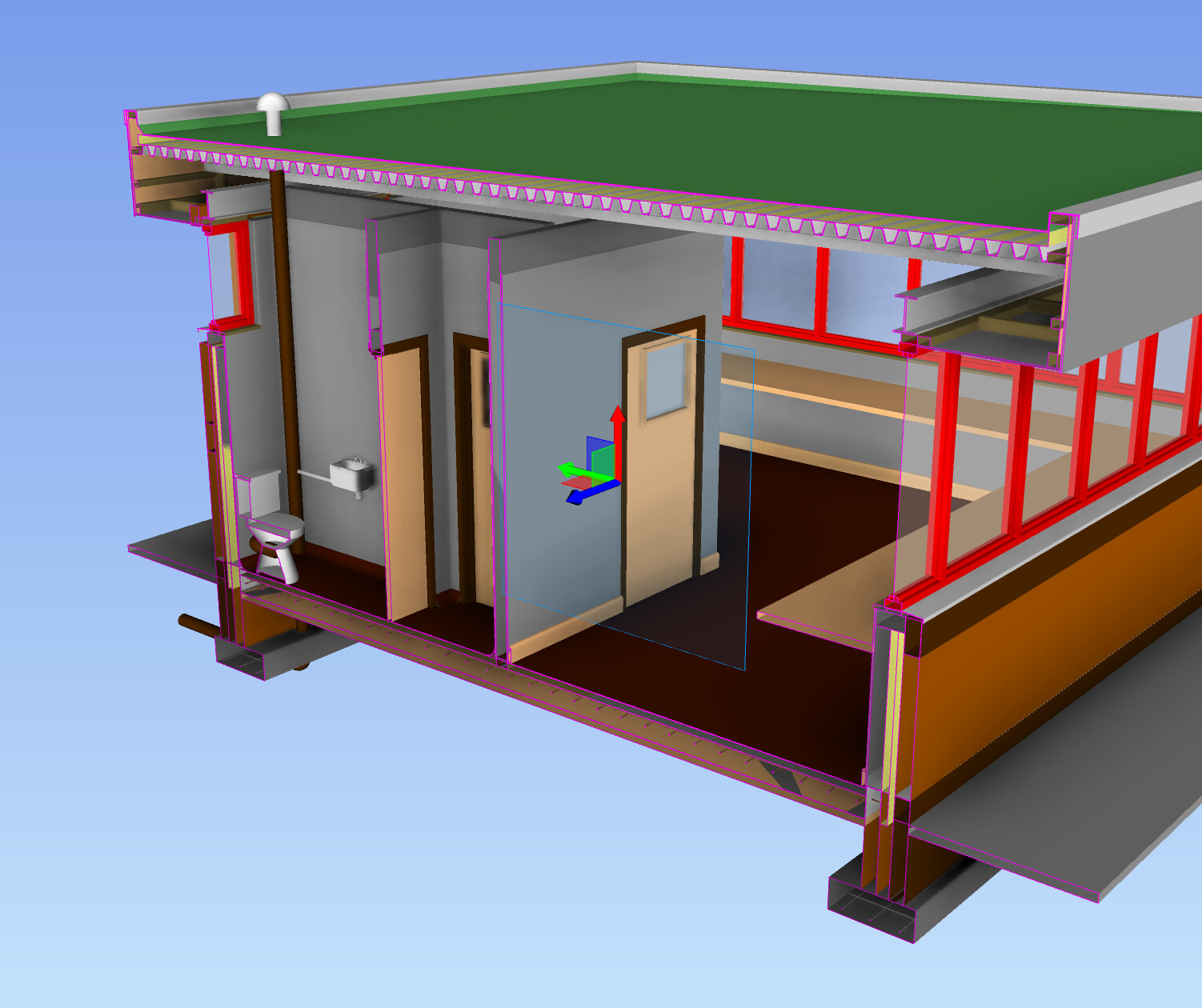
Utopia :
But I would love if there would be a way for Section Box,
to show solid Cut Faces … for easier geometry understanding.
For my taste by a simple solid color.
(Not Object Color or even Materials or Hatches …)
E.g. simply a dark gray. If a color - there is soon a wish for customization
or personalization.
We’ve tried that, it’s not easy. Here’s@alex’s log if you’re curious - no easy feat to do right. Emphasis on the “try not to cry/cry a lot” meme inside
For the rest:
view navigation zoom to point of interest: can be done. we’re extracting the controls out into a module so it will be easier for us to experiment and have various control settings.
the rest rest cc @Agi to help me keep track of things - super valuable feedback, thanks!
We’d also like to have the section box show solid fills, and like Dim mentioned we have tried it in the past and we managed to get it working properly for 80% of all possible stream content. It’s the remaining 20% that made us park this feature
I personally haven’t given up on getting this 100% of the way and we will revisit this topic in the foreseeable future
I am aware of.
In the last 20 years I have seen many Apps fighting to implement that feature.
Solid or Mesh based. Microstation, Modo, Vectorworks, …
Meanwhile most of them have reasonable 95% solutions.
E.g in Vectorworks, you will get voids in the cut face where geometry overlaps)
That is why I sorted it under Utopia
This [quote=“dimitrie, post:5, topic:6428”] Here’s
[/quote] looks already pretty promising.
But I feel with the developer …