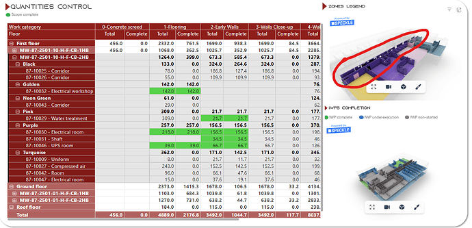
Colors bad behavior in power BI when conditional formatting is based on a measure that can change according to a slice

Hi, guys!
I hope you are fine!

So, I am doing some tests with Speckle, to understand limitations and uses, and I am really excited with the current results.

By now, I want to make planning more accessible, and I aim to have a 4D simulation in PBI. I’m testing speckle for it for the first time.

The problem I am facing is that if I use a measure as conditional format, and this measure can change for the same revit object acording to a slicer, the model behaviour in PBI is kind of strange.

Giving context: I have this DAX measure here:

HEX_Status_4D =
SWITCH(
TRUE(),
max(‘Calendar’[Dates]) > max( DIM_IWPs[IWP Finish date])&& max(DIM_IWPs[IWP Finish date]) <> blank(), “#4eea4e”,//Green
max(‘Calendar’[Dates]) >= min(DIM_IWPs[IWP Start Date]) && max(‘Calendar’[Dates]) <= max(DIM_IWPs[IWP Finish date]) && max(DIM_IWPs[IWP Finish date]) <> blank(), “#58adfa”,//Blue
blank()
)

It means that if my object is related to a IWP Finish date that is already due (according to a date slicer I select), the object should be green (complete). However, if I pick a date in my slicer that is between the IWP start date and IWP finish date, the object should be blue (in execution).

The problem is that if I use “too much” the slicer, speckle visual seems to start “getting confused”, what means that for the same date picked in the slicer, sometimes it returns green, other times it returns blue. This one seems to be a bit harder to get sorted, but I hope you guys can help me.
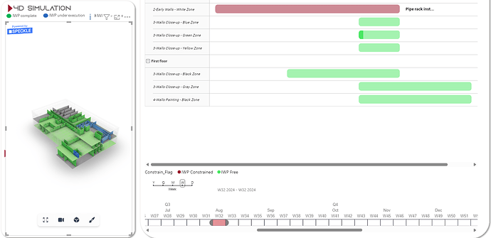
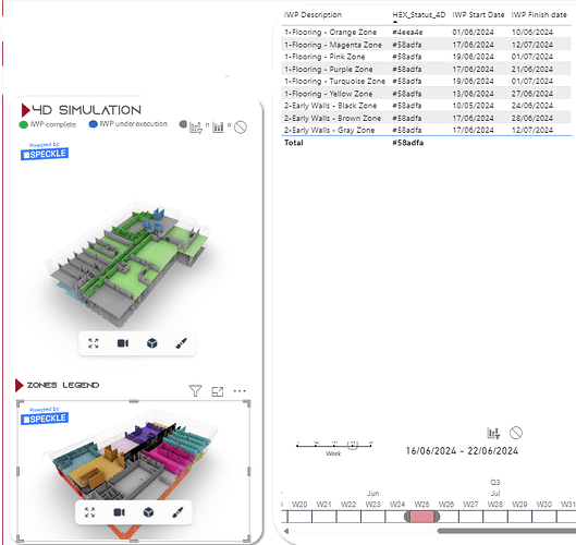
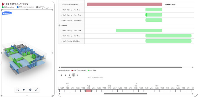
Week 32 selected on slicer - bad behaviour:

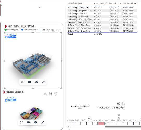
Week 32 selected on slicer - expected behaviour:

Sometimes it returns the expected, sometimes the bad behaviour.
Thank you so much!
1 Like

Hey @wlipemoura,

Can you please confirm the PB Connector version that you are using?

Thanks

Hi, Nikos!
I am using version 2.19.0

We have already noticed that something is broken with the slicer in version 2.19.0 and have a ticket to fix it in the current sprint.

First, try adding some data to the Tooltip Data field. Some users reported that this fixes the issue. If you are still having the problem, try downgrading to version 2.18.0 and again add data to the Tooltip Data field; the slicer should work properly there. You can find version 2.18.0 for both data and viewer on GitHub.

Let us know how it goes. Sorry for the inconvenience.

2 Likes

Hi, Nikos!
Sorry the delay in answering. I’ve just tested it again with the 2.18.0 version, and the problem keeps happening.

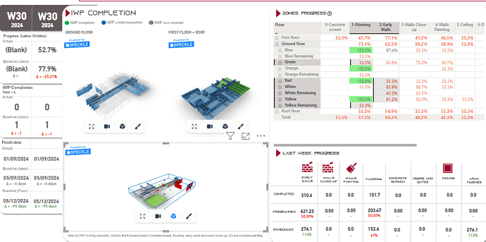
Take a look: HEX_Status_4D is responsible for coloring the 4D simulation.
In the zones legend you can associate each area to the table.

So… Only the floor of orange zone should be green, see? “#4eea4e”. All the others should be blue “#58adfa”. I mean, the table is the expected behaviour, but the 4D simulation is broken…

Again… it happens after some manipulation with the filters. When I use it once or twice, it returns the expected result, as you can see below.

Any idea?

@Nikos , tagging you just because I’m not sure if you’re notified if I don’t.

Fear not, we see everything.

1 Like

Hey, @wlipemoura

To investigate your case further, you need to share your dashboard with us. There might be something wrong with the conditional formatting or data relationships, so more on the PowerBI side.

I’ve sent you a Google Drive link to upload your dashboard. Please use the email address you are using in the forum. (check your spam folder)

Thank you

1 Like

Hi, Nikos!
Sorry the late.

I got on annual leave the day I received your message… so, coming back to our new old issue :smiley:

I’ve just put a version of the .pbix on the folder. Thank you for your help.
Best regards!

2 Likes

Hi, Nikos!
I hope you are fine!

New piece of information that may help us to understand what is happening.
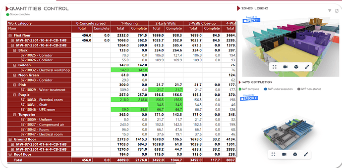
As you can see below, the corridor is colored in black (it is the black zone). However, when I select the alphanumeric code, it turns in purple. I think maybe the same problem is causing this error may be responsible for the previous one.


Hey @wlipemoura,

Sorry for the late reply. I was trying to wrap my head around all the information in the dashboard.

I managed to reproduce the issue, but I am not 100% sure if this is an error from the Speckle 3D Viewer.

For example, the Zones legend Viewer with the Hex_Color (calculated column) color condition works properly. So, I am guessing that this might be an issue with the Power BI measures and the 3D Viewer.

The only workaround I can see at the moment is to avoid applying measures as conditional formatting to the 3D viewer. Instead, you might try creating a new table to generate a color code for each element at each stage and then relate that to the dates, etc.

I will keep investigating the cause and let you know how it goes.

1 Like

Hi, everybody. Just FYI, I’m coming back to dealing with this project and will let you know about the advances during the next days. No progress so far.

1 Like

hey @wlipemoura ,

Any updates?

Hi, @gokermu .
Still struggling with the colors. It does not work properly at all with filters. Now I want to create a report with only some of the areas and it does not work. Can you help me?

In the attached image, you can check that there is no yellow part in the inferior model. That’s because somehow, when I select the red and the yellow together, the yellow becomes white. Why? No idea…