Got my invite, thanks!
Do I need to create a new account to access the Speckle Latest (dev) Speckle Server?
or should I be able to use my “original” account that I set up when I first joined Speckle?(this option isn’t working, I’m getting an error: “invalid credentials”).
Thanks!
Oh good point! I should have mentioned it, yes, you need to make a new account for the test server.
All our connectors provide a way to switch between accounts, so hopefully managing multiple accounts won’t be a pain 
Thanks for your help!
Hi!
Can you send me an invitation, plz!
Welcome Amadeu!
Invite sent! In case you didn’t know, we also have stable version at:
Super, I’m interested!. Can you send me an invitation.
On its way! Feel free to Introduce yourself 🙆 if you’d like.
Also, remember to use XYZ for any production work 
Great initiative @teocomi! I would love to become a Speckle Tester, so please send an invitation 
Greg Please, he was told he must provide 20 characters 
Great idea to have a tester program! Sign me up!
Nice initiative! I would like to become a Speckle Tester as well.
All invited! I’ll also make a forum group with you guys later 
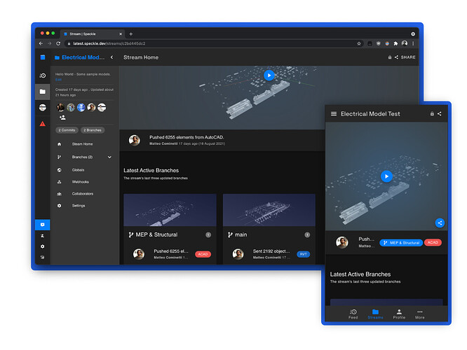
 Hey @Testers! We’ve just pushed a rather big frontend update to latest that solves some issues, improves mobile layout and makes way for future UI extensibility:
We’d appreciate if you gave it a go, and please drop screenshots in here if you encounter any issues 
Totally. Good spot! I’ll do a crazy thing right now, and commit straight to master a fix.


 . Great


(Have to make 20 characters)
Good stuff! As usual 
Some quick thoughts from my side.
- Great improvement!
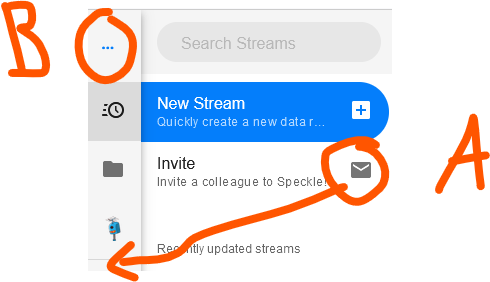
- Maybe move the invite button to the left side menu (see A in screenshot 1) because it’s not really part of the stream but a more high level action?
- When the left side menu is collapsed, you see a few dots on the top left (see B in screenshot 1), maybe place the Speckle icon there?
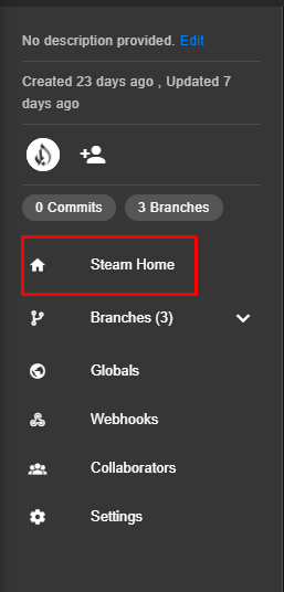
- Typo on the globals page (see screenshot 2, sorry I just love windows Snip & Sketch
 )
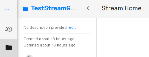
) - I noticed some inconsistency when the left side menu is open or closed. When you go to the Feed or Streams page it looks the same (screenshot 3), which is good. However, when you open a stream it looks different (screenshot 4). Might be better to use the same icon (so ≡ instead of <)?
- On a stream page with the left side menu out, you quite quickly reach the character limit of stream names (see again screenshot 4). This is not the case when the left side menu is collapsed (screenshot 5).
- When on the Feed or Streams page and the left side menu is closed, this guy pop ups on the top right to create a new stream:
 . It’s not really needed, in my opinion.
 - Did I already mentioned I really like the changes?
Screenshot 1

Screenshot 2

Screenshot 3

Screenshot 4

Screenshot 5
![]()
Thanks @JdB, they’re all valid points. Problem “B” from screenshot 1 I can’t reproduce unfortunately, could you tell me browser/os/resolution combo? It’s where the Speckle logo is 
The rest I can massage into place. The  with a + inside should actually appear only on mobile, but i seem to have fumbled some breakpoints.
Happy you like the changes! They’ll allow us for future expansion (more sidebar items for new features such as projects/organisations, lots of room for a table view under the viewer now, etc). I won’t raise an issue with them, as I’m a bit lazy to copy paste these in one. We’ll refer to this thread 
Problem “B” appears to be a browser issue. I used Firefox on Windows with 1920x1080. I tried a bunch of lower resolutions as well (all the way down to 800x600) but it remained the same in Firefox. In Chrome and Edge I do see the logo as it should.
Sounds good. Also nice indeed to have room for future features!
I fixed it - FF didn’t like svgs as background images, as vuetify’s default v-img component works. I’ve fixed most of the things you’ve pointed out 
The changes should be on their way to latest.speckle.dev as I type right now.

