Hello there,
I’m working on a project with a very simple Rhino model I’ve made, exported it to an .OBJ file and imported into Speckle for subsequent use in Power BI using the latest Power BI Visual (2.19.0).
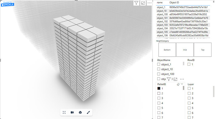
My 3D model consists of a really simple design of 60 Pallets, each containing 168 Boxes pr. Pallet. Think of it as an array of boxes.
As i’m completely new to 3D-design, all the parameters and dimension tables are created in seperate files and then imported into powerBI. In my dimension tables I have an object id that is related to each individual box, as well as information like “PalletID”, “Layer”, “RowID”, “BoxID”, as well as a X-Y-Z coordinate for all 168 boxes inside a Pallet (e.g. the top box has the “PalletPosition” value of (1,1,1).
My Objective is to color each individual box, based on a treatment that i have given it. For instance, the boxes 1-5 in Pallet 1 have received “Treatment 1”, 6-10 = “Treatment 2” and so on.
Furthermore, each treatment then has a quality score from 1-100, based on the results of the experiments. That I want to show as a tooltip value.
However, I haven’t found any good tutorials to adding “non-speckle-data” to the Color By or Tooltip Data.
Do you have any suggestions on where to get started?
When I try and add my Treatments and Quality score to the visual, It doesn’t really go as smoothly as the videos made by Bilal. For instance, I can’t view the Treatment pr. box but only the “First” of Treatments or “Last” of Treatments, which is then applied to all boxes inside a Pallet.
I think my objective is within the framework of what should be possible, so I hope you guys can help.
An example image of a selected pallet is here:
The link to the Pallet Speckle Model is here:
https://app.speckle.systems/projects/3d7780e8fe/models/b93495eef6
All the best,
Emil

