Hello team,
I am looking to prepare a dashboard for one of our clients. The limitation which I came across is the matching of colours in Power bi to other graphs or charts.
Is there any workaround or development around this ?
Hello team,
I am looking to prepare a dashboard for one of our clients. The limitation which I came across is the matching of colours in Power bi to other graphs or charts.
Is there any workaround or development around this ?
Hi there! Welcome to our community @Rahul.sehgal
This has been requested before, and I started looking at how that could work, but I don’t have an ETA at the moment for when this will happen.
I can say for sure that it will happen, as without consistent colors, a dashboard looses a lot of it’s meaning and readability.
Thanks for bringing this up though! If you have more requests (or issues ![]() ) don’t hesitate to let us know.
) don’t hesitate to let us know.
We’ll keep you posted on this thread whenever we get to it! ![]()
Thank you Alan for the quick reply!
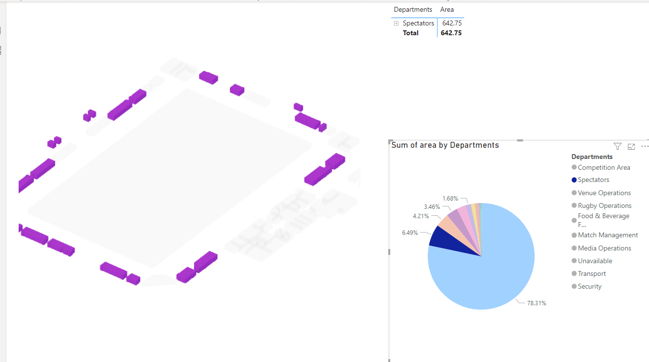
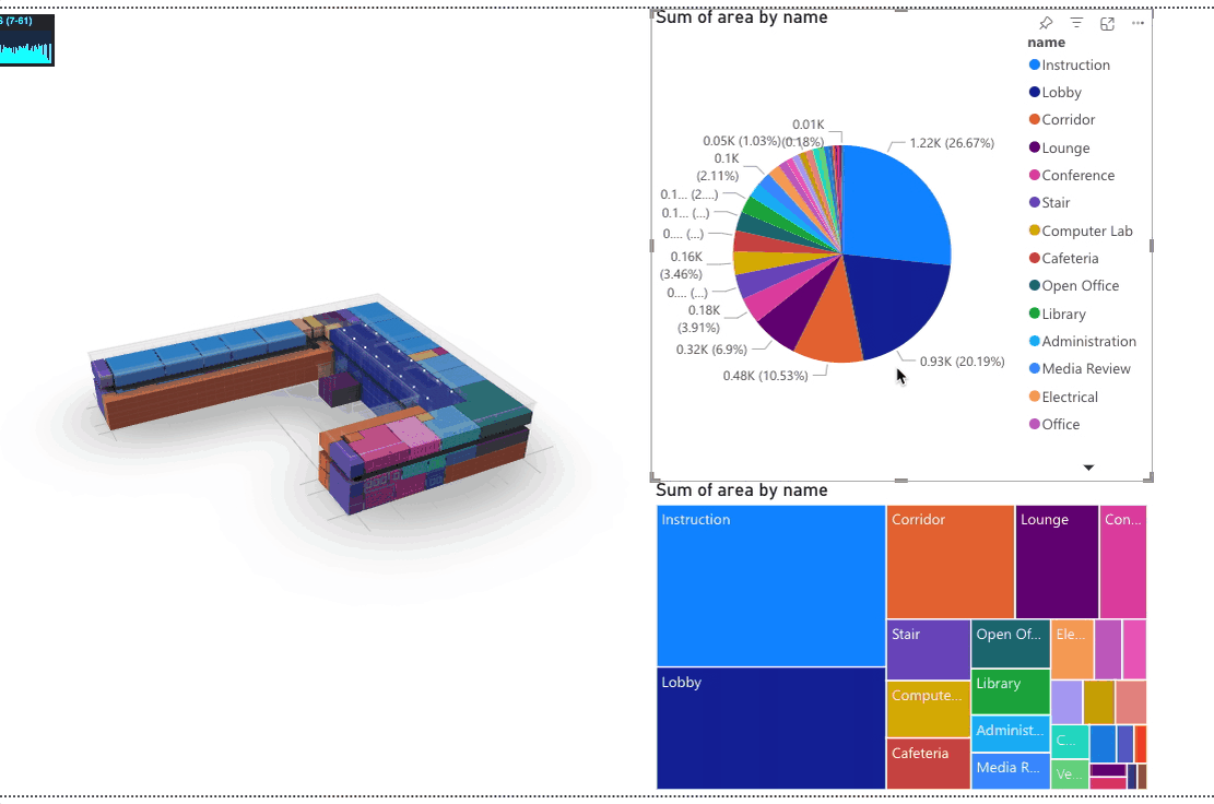
To share some more context, the project team needs to submit to the client on April 28, which is very soon. It’s a stadium project and the team showed the initial dashboard to the client. The client was happy with the 3D model but pointed out the colors don’t match and didn’t find it usable in it’s current state, unfortunately.
I can imagine there is a pile of other feature requests and things to develop so could you shed some light on this specific feature and how it might fit in the roadmap? Then we can set expectations for the team so they can wait for this new feature ![]() or… look into other solutions
or… look into other solutions ![]()
Either way, we are happy with all the stuff the Speckle team is working on!
Since it was mentioned somewhere else on the forum that Power BI is a focus in the next coming weeks, we’d like to share a bit more feedback on two items. These two items have, in our opinion, less priority than matching the colours correctly, but we thought it would be good to share.
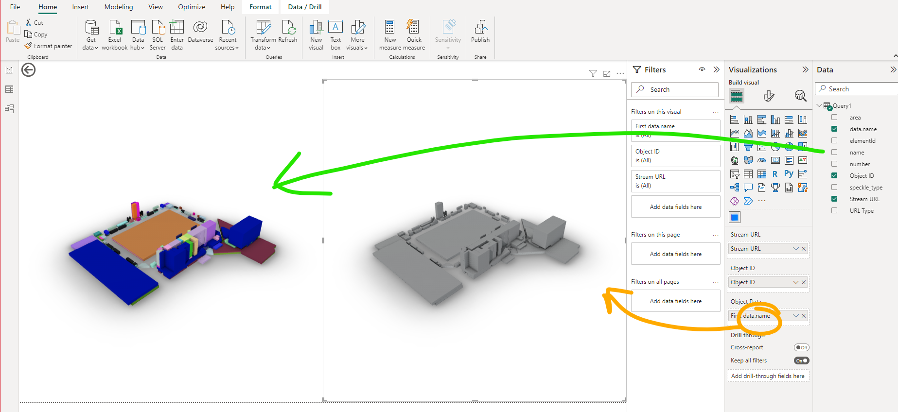
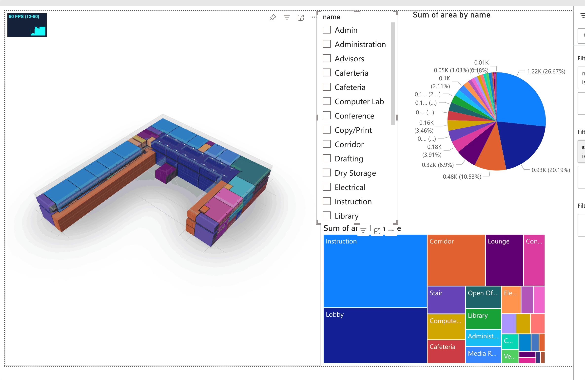
If the input on Object Data contains special characters coloring doesn’t work. Renaming a parameter in the right hand pane doesn’t work, the parameter name needs to be specified correctly in the query itself. So if we would “data.name” to “testing” and reapply it to the viewer the colours don’t show up.
When replacing the parameter in the Object Data the viewer isn’t updated. You first need to switch to a different tab and go back to refresh the viewer.
Quick sneak peek of what’s coming up just to get you drooling ![]()
I just managed to get this working today so end result may not behave exactly as the gif… but as always feedback and wishlists are welcome! ![]()
As for this @JdB
…![]() ! .
! .
Great stuff! As always ![]()
Feedback Time!!!
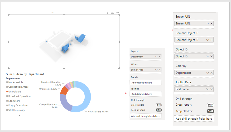
Would you rather have this type of selection? Where the selected objects are shown in “Speckle blue” color?
Or this type of selection, where we ghost everything except what’s selected?
Or would you rather have this as a toggle in the visual settings?
I personally prefer Ghost one.
Alan, you are killing it. ! It seems its pretty much aligned what we are looking for. For your testing can you please include some categories visualisation like furniture or MEP, AHU’s etc just to understand how it responds respectively.
Lastly, My major aim is to visualise the construction sequencing with connecting Power Bi and Revit Through speckle.
Cool! I think ghosting looks better and you can clearly see where the selected objects are positioned. So maybe just role with that for now until someone has specific needs for a different approach?
Amazing, I’m also leaning towards the ghosting one as a default.
Will do ![]() If you share with me a model (or part of it) i can test with that. I don’t have many MEP models to test with.
If you share with me a model (or part of it) i can test with that. I don’t have many MEP models to test with.
I think this should be doable with some “selection” + “slicing” options. We still need to properly implement “drill-down” (which I’ll confess I still don’t fully understand) ![]()
You an consider Autodesk sample project may be ?
FYI, I just released this morning a new version of both the Data Connector and the 3D Visual.
I still have to update the docs (next week), but if you’re keen feel free to give it a try!
You’ll need to update both, as the data connector has a new column in it’s output table that is required as input for the visual to work
Hello its me again,
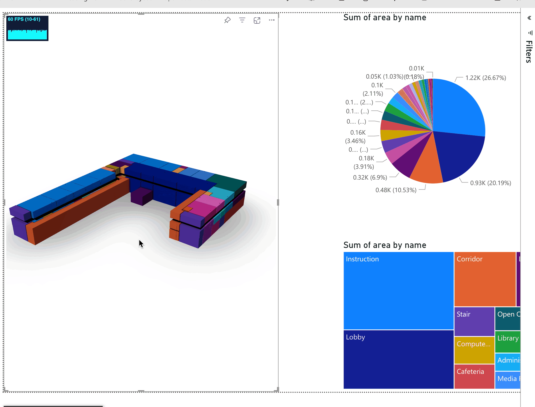
I believe there is a bug in colour matching in new visual as well. When you take the parameters from drill down query, colours starts to mismatch.
Thanks
Rahul
Small detail (but maybe important to reproduce the error), the parameter has been renamed in the query editor.
Is the sorting in the 3D visual the same as the one your chart uses?
Can you show me a gif of exactly how you get to the missmatched colors?
yes its highlighting the same zones but in donut chart its orange and in the 3D view its blue. I hope this helps
Could you describe the process that leads to this happening step by step? Or send us a gif that allows us to figure out how you get there?
Or better yet, can you share the report?
I can’t seem to reproduce this on my end.
Hey @Rahul.sehgal ,
Just wanted to let you know that we’ve created a tutorial that might help you with the color mismatch issue you’ve been experiencing. Would you like to check it out and let us know if it works for you?