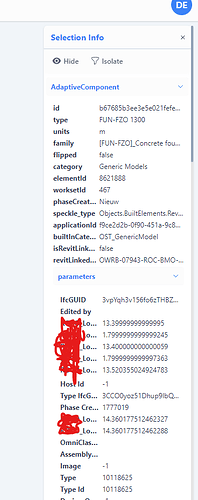
this one, it is not resizable so i have a hard time reading my properties ![]()
@Agi another topic and not part of @Dickels112 argument, but as I have seen it again. Would be good to have a scheme for the decimals to what Jonathon proposed the post below.
@Dickels112 We will look into this issue. The solution we go with might be more similar to what we have in FE1 (outputting the full value in a tooltip on hover) over making the window resizable, but let’s see. A resizable window could also be very useful though, but it will not necessarily fix the issue of truncated properties if the values are very long.
@AlexHofbeck We will look into this as well. I’m not sure about the solution just yet, but I agree the many decimals can be overly detailed + they bloat an already busy sidebar.
my main issue is not with the trailing zero’s but with the truncated parameter names. should i want to make full use of the viewer i dont want to hover over each param name to figure out whether or not that one is what I want. Also, some people will write text in some params (comments, etc) these of course are easier to read when the window is resizable instead of fixed.
As a BIM Data Analyst, my primary use case for Speckle was the inspection and scrutiny of the data.
In my case, I would have liked, in FE1 as well, to be able to ![]() or
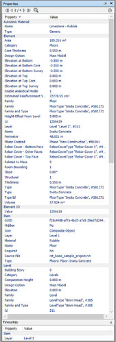
or ![]() favourite a subset of properties such that they could be easily compared element to element. As such, the truncated properties or otherwise in the complete list would be less of a concern if I could focus on what was important.
favourite a subset of properties such that they could be easily compared element to element. As such, the truncated properties or otherwise in the complete list would be less of a concern if I could focus on what was important.
This is why Properties+ was my all-time top addon installed in Navisworks and its ultimate successor. Properties Panel Enhanced.
I think my dream solution would be replicating something like this (though I have feedback for that too)
@Dickels112 Makes sense. Noted!
@jonathon Favouriting properties is an interesting workflow. In your example, do you remember if the favourites would persist in that bottom section if selecting another element that doesn’t have those properties? So value would just be null.
i can demo for you ![]()
@Dickels112 The selection info panel is now resizable :). Check it out!
Plus a couple other improvements to the panel:
- The panel now takes up the full height of the screen.
- Your selection’s properties are now expanded by default when the panel opens. Before it was closed, so it was always one extra click.
- The panel doesn’t disappear when you hide a selection.
- You can copy property values to your clipboard by clicking small icon that appears on hover.
- Better visual hierarchy
There’s still a lot we want to improve, but it’s getting better!

