[Feature Request] Add contrast to commit message (text) box

Hello,

I’ve been using the Speckle Panel on Rhino, and I find the textbox a bit hard to use. Maybe the background can be white? Or, text can be white (or speckle blue?)

image

The main issue is that after a commit, the text box does not clear. And I keep forgetting to clear the nearly invisible text (previous commit message) before typing the new one.

Is there some setting to change this? Or this needs to be changed on your(developer) side?

TIA

~ ~ ~ ~ ~ ~ ~ ~
Kaushik LS
Chennai, IN
The comment field isn’t clear on send by design, but its current contrast can be problematic.

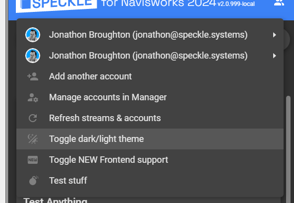
All Speckle connectors and managers can be set to LightMode :bulb:

Change mode in Connectors from the Top right account settings icon
Screenshot 2023-09-21 080727

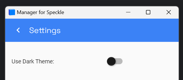
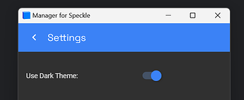
In Manager, this same setting can be changed from the Settings pane
Screenshot 2023-09-21 074959

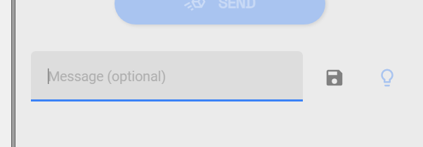
Comment text box in Light Mode
Screenshot 2023-09-21 080744

1 Like

Thanks, this is a quick fix.

2 Likes