Visualize data like daylight factor

I am trying to visualize simulated spatial data, for example daylight and thermal comfort, in Speckle and so far this is my process:

  • Export the result from the simulation tool as CSV-file including x,y,z,dx,dy,dz,value
  • Create a cylindrical mesh for each value in Blender with value stored as custom property
  • Stream geometry and result meshes to Speckle.x.y.z

This works surprisingly well, see attached example (show the properties of Daylight Factor):
https://speckle.xyz/streams/b54e8ff61d


Still, I have some questions:

  1. Would it be possible to change the color scale of the property? It would be useful to have different scales depending on the unit.
    Skärmbild 2023-09-30 142241
  2. Is it possible to show other objects less transparent when a property is visualized? It is hard to see where the values are located.
  3. Would it be possible to add a unit using this process?
  4. Would it be possible to visualize data like this without creating a lot of geometrical objects?
  5. Could the objects be grouped in some way, for example, just showing daylight on level 2?
  6. Would it be possible to have fixed max and min values in the color scale? Right now they change depending on the min and max value.
  7. Would it be possible to show a color scale?
1 Like

Hey @MaxT ,

Thank you for sharing your work with us. I must say, it looks quite impressive.

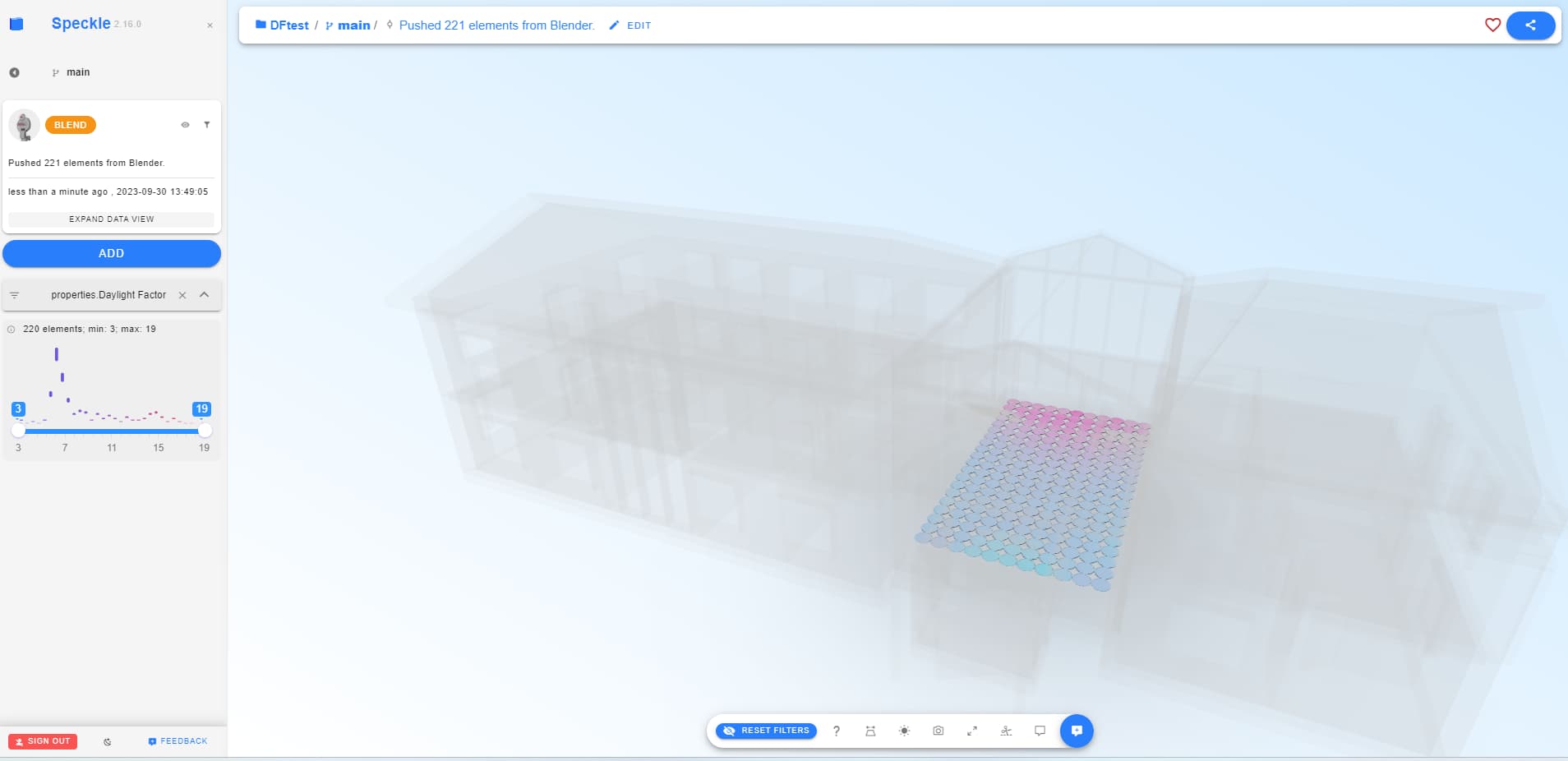
Based on my understanding, you are utilizing the filtering options available in our web application to color different elements. However, I would like to bring to your attention that our current front end has certain limitations. We are actively working on a new front end, which you can access via https://latest.speckle.systems.

Please feel free to share your feedback regarding the filtering options in this channel. We will take all your suggestions into consideration once we start the development of filtering options in the new front end.

We have observed that many of our users utilize the Power BI connector to develop custom applications for data visualization. With Power BI, you have the ability to control how hidden geometry is previewed - either completely hiding it or showing it ghosted. Additionally, you can apply conditional formatting to color your visualizations (https://youtu.be/YOiuUkNQ1oU?si=IKNWYUkYc6u2-CU1)

Yes, definitely. You can create a plane and bake the colors to the vertices and send that to Speckle. It’ll look much nicer.