I’m responsible for rollout and training of Speckle in my firm. A user in my firm had some confusion around the Speckle mapper in Rhino. When they explained why they were confused and it ‘wasn’t working’ I understood why they got tripped up. The user was just wanting to apply simple Revit categories to their geometry (not apply specific Revit types, so they didn’t need to go through the entire process of ‘selecting mapping choice’ requiring exporting form Revit). They overlooked the text that says ‘optional’ on that step , so went through the entire process in Revit of exporting the mapping and importing in Rhino.
I don’t know how to improve it…but is there a way to make it more clear that they don’t have to do step 2 and can skip to step 3? I know it says ‘optional’, but its easily overlooked by new users. Not sure if this is a good idea, but could you flip-flop the ui, so the last 2 sections are flipped?
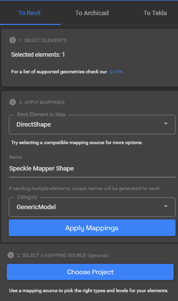
understand the logic of the order of how its set up now, and its actually the most logical, however is there a way to avoid confusion in the mapper? Again, its less logical, and I’m not sure how to fix it… Or maybe the button instead of saying [Choose Project] says [ Choose Project (Optional) ] ?? Again, i don’t love those ideas, and I’m not sure how to fix it, but wanted to pass along the feedback since yall are making such a great product!