I think something worth observing and sharing. Something about the v2 logo just feels off, in the back of my mind something doesn’t feel right and I think I have gotten to the bottom of it.
The Speckle “cube” isn’t actually a cube, the left and right edges of the front face are pixel perfect vertical, however the top and bottom edges are again pixel perfect parallel, however they are on a slight angle from horizontal. So the front face isn’t actually a square but it is close enough to appear like a square to our eyes. So to our eyes, the Speckle cube is a cube just slightly rotated, but then the text of “Speckle” in the logo isn’t rotated, so we would expect for the gap between the cube and “Speckle” to be non-uniform:
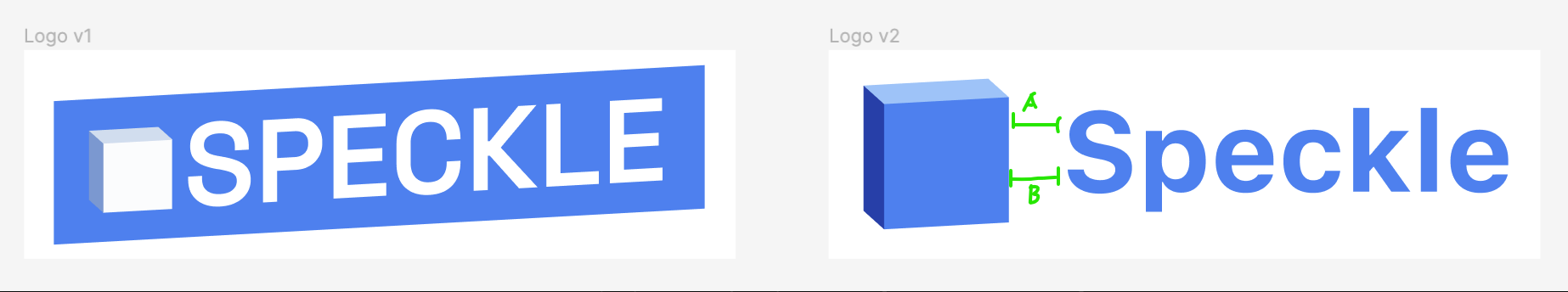
We would expect for the distance of A and distance of B to be different, B lesser than A since the cube is rotated counter clockwise ever so slightly.
However since the right edge of the cube is pixel perfect vertical, there is no change in gap. There are two elements on the page which our eyes have assumed, and those assumptions are not correct, resulting in a small “huh something is just ever so slightly off” in the back of the head.
Now v1 cube is the same as v2, so why do I think it doesn’t occur in v1? Well simply put the text is offset enough that our brain doesn’t perceive the word “Speckle” and therefore the spacing and imperfections aren’t as immediately obvious. I also think that the cube denotes a pattern which is then carried out throughout the entire logo, the vertical edges align with the letters being vertical, and the angular offset of the horizontal edges is the offset of the letters and the surrounding blue background.
And thus, I have another Easter Egg (Easter Eggs 🥚), the Speckle Cube is a lie and secretly v3 of the logo will be a cake instead of the cube…