Our team is quite split and we need your help to decide! The logo will show on all our UIs and swag too.
If you’ve got skillz and feel like suggesting something else, we’d love to see it - here’s a figma with the current options.
Didn’t expect that.
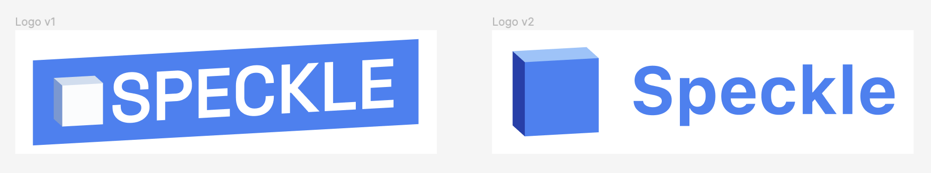
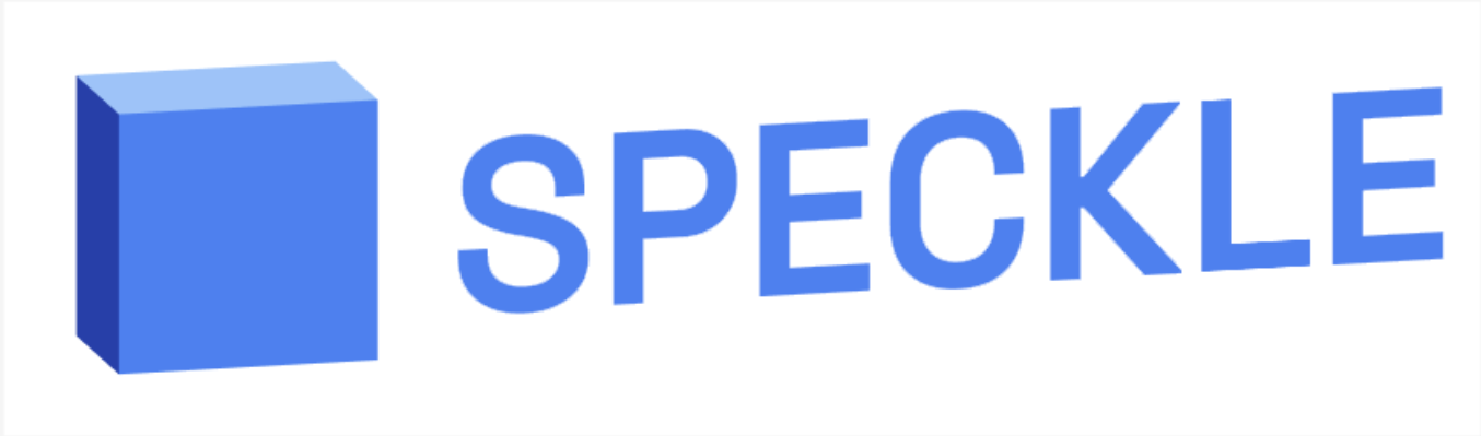
I think I prefer the V2 as being horizontal vs at an angle.
Seen on the examples,
as it is a logo and not really adapts to the path text font,
I would like a background to better separate it, similar to the V1,
but horizontal for me. Maybe the Cube a tiny bit more rotated
to not miss that it is “3D”.
(Had to look twice to realize that V1 Cube was also already 3D.
For me V2 Cube looks more 3D-ish somehow)
V2 - no brainer: the brand identity is wrapped in that logo - 3D, adaptable, memorable, simple, can be used without any words to be recognizable… I can go on and on, there’s really no debate here if you think 10 years in to the future.
I think something worth observing and sharing. Something about the v2 logo just feels off, in the back of my mind something doesn’t feel right and I think I have gotten to the bottom of it.
The Speckle “cube” isn’t actually a cube, the left and right edges of the front face are pixel perfect vertical, however the top and bottom edges are again pixel perfect parallel, however they are on a slight angle from horizontal. So the front face isn’t actually a square but it is close enough to appear like a square to our eyes. So to our eyes, the Speckle cube is a cube just slightly rotated, but then the text of “Speckle” in the logo isn’t rotated, so we would expect for the gap between the cube and “Speckle” to be non-uniform:
We would expect for the distance of A and distance of B to be different, B lesser than A since the cube is rotated counter clockwise ever so slightly.
However since the right edge of the cube is pixel perfect vertical, there is no change in gap. There are two elements on the page which our eyes have assumed, and those assumptions are not correct, resulting in a small “huh something is just ever so slightly off” in the back of the head.
Now v1 cube is the same as v2, so why do I think it doesn’t occur in v1? Well simply put the text is offset enough that our brain doesn’t perceive the word “Speckle” and therefore the spacing and imperfections aren’t as immediately obvious. I also think that the cube denotes a pattern which is then carried out throughout the entire logo, the vertical edges align with the letters being vertical, and the angular offset of the horizontal edges is the offset of the letters and the surrounding blue background.
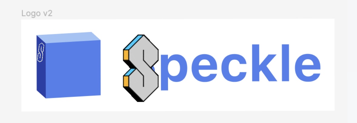
And thus, I have another Easter Egg (Easter Eggs 🥚), the Speckle Cube is a lie and secretly v3 of the logo will be a cake instead of the cube…
If v2 wouldn’t have that kind of “default” font (doesn’t feel like it’s still part of the logo, in my opinion), i would definitely prefer v2 too … simpler, cleaner… but currently I voted for v1.
I would vote for option 2, if and only if I could have a user setting to make the cake my icon. Sort of like an opt in experimental feature kind of thing
As I said,
now, rainy Monday and the V1 people are back online and the voting
gets more equal again.
No w that I looked again,
I like more that the (Speckle) Cube is more pronounced.
And now I even notice that V1 naming was upper case.
I prefer the standard casing.
But for a Logo font maybe needs a bit fine tuning for the
distance between the letters.
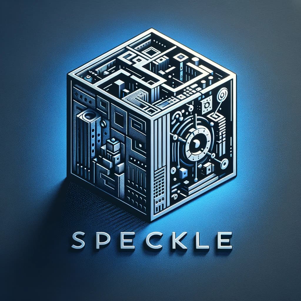
Dalle-3 Prompt:
Design a sleek, modern logo that reflects the advanced technology and interoperability of Speckle. Include a stylized 3D cube that is interconnected with various geometric shapes, representing different AEC software.
hmmm v1.5 maybe? Feels like the Cube definitely has to be the trademark blue color associated with Speckle, but smth about the font cube combo in v2 looks a little clunky…

